About the Metro design
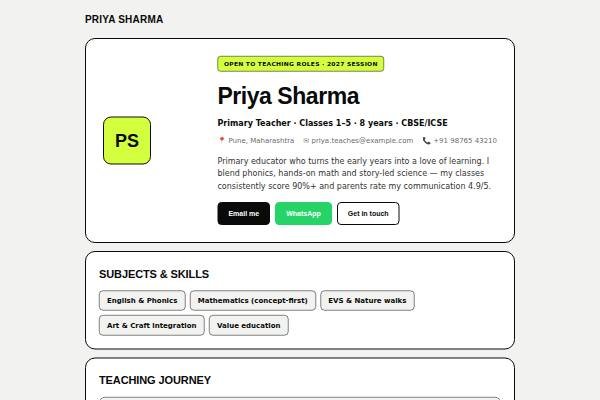
Metro is the boldest of the simple templates. Every section is a white card with a thick black border and generous rounded corners, stacked on a pale grey background, and a sharp acid-lime highlight marks badges, dates and your initials avatar. Headings are uppercase Space Grotesk; body text is Inter. The hero puts your name, role, location and a short intro beside a square avatar, with dark, WhatsApp and outline buttons underneath. Below come skill pills, a dated journey, education cards, a two-column quote grid and contact.
Design highlights
- Thick two-pixel black borders on every card give a confident, poster-like look.
- Acid-lime highlights mark the badge, date chips and square initials avatar.
- Skills show as bordered pills, so a long tool list stays tidy.
- Testimonials sit in a two-column grid that collapses to one column on phones.