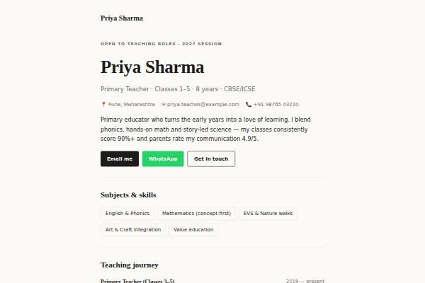
About the Paper design
Paper is the quietest design in the library: a minimalist editorial page that reads like a printed profile. The background is a warm off-white, the text is near-black, and the only decoration is a thin hairline rule under the hero and between items. Your name is set large in Newsreader, a refined serif, while Inter handles everything else. There are no animations or colour accents to compete with your words. Sections are the essentials: intro, skills, experience, education and certifications, testimonials and contact.
Design highlights
- A large Newsreader serif name over a hairline rule, like a magazine byline.
- No colour accents or animations, so the page prints cleanly and reads calmly.
- Generous white space around each experience entry makes dense careers easy to follow.
- Shares the same content fields as Metro and Slate, so switching keeps your text.