About the Marginalia design
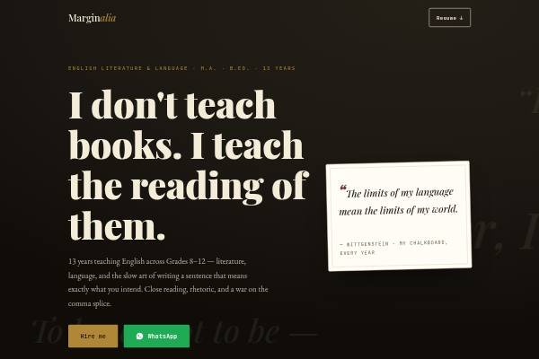
Marginalia looks like a well-read manuscript. Ruled cream paper carries the body, a sepia-black band holds the hero, and accents are oxblood, old gold, forest green and ink blue. Playfair Display sets the headlines, EB Garamond the reading text, and JetBrains Mono the small captions. Words drift across the hero, a blinking caret sits after the headline, and a story-arc line draws itself in the method section. Sections are named like a book: a preface, the syllabus graded, chapters of experience, marks in the margin and a margin-notes blog.
Design highlights
- Floating words and a blinking typewriter caret make the hero feel like a page being written.
- Each lesson is drawn as a narrative arc, with exposition, rising action and resolution steps.
- Experience is laid out as chapters, so a long career reads like a table of contents.
- A margin-notes blog section shows short essays or reading lists in a serif column.